Agave
Agave Case Study
Overview
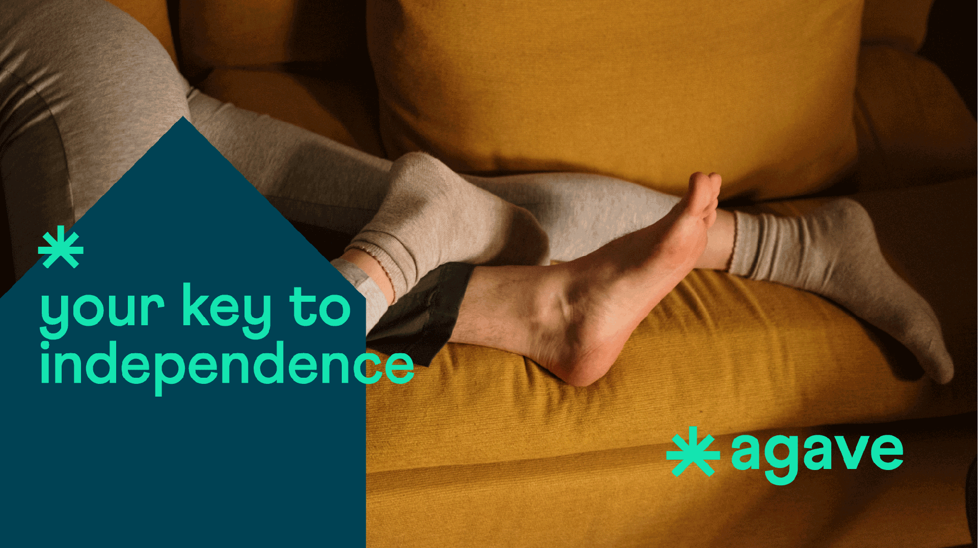
Agave, a dynamic real estate development startup rooted in Paraguay, is revolutionizing the industry by delivering exceptional quality buildings at affordable prices, specifically tailored to meet the needs of new and burgeoning young families.
The Challenge
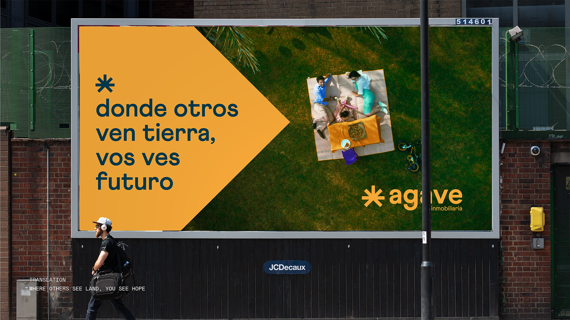
The real estate market is becoming increasingly harsh on young families as gentrification trends among wealthy developers make housing expensive and exclusive. Agave needed a brand identity that would connect with hard-working families and communicate affordability without compromising on quality or aspiration.
Design Approach
Our approach centered on three key principles:
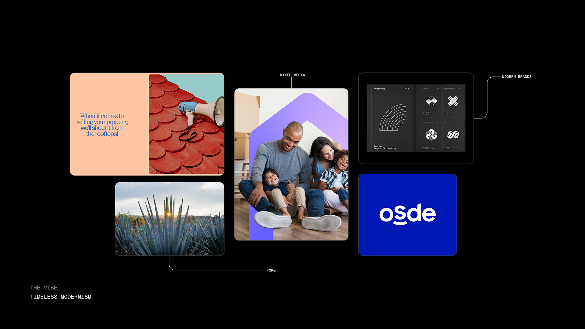
- Authenticity: Using real photos and real people to create genuine emotional connections
- Accessibility: Creating a visual language that feels approachable rather than exclusive
- Hope: Infusing the brand with optimism and the possibilities of home ownership
Brand Identity

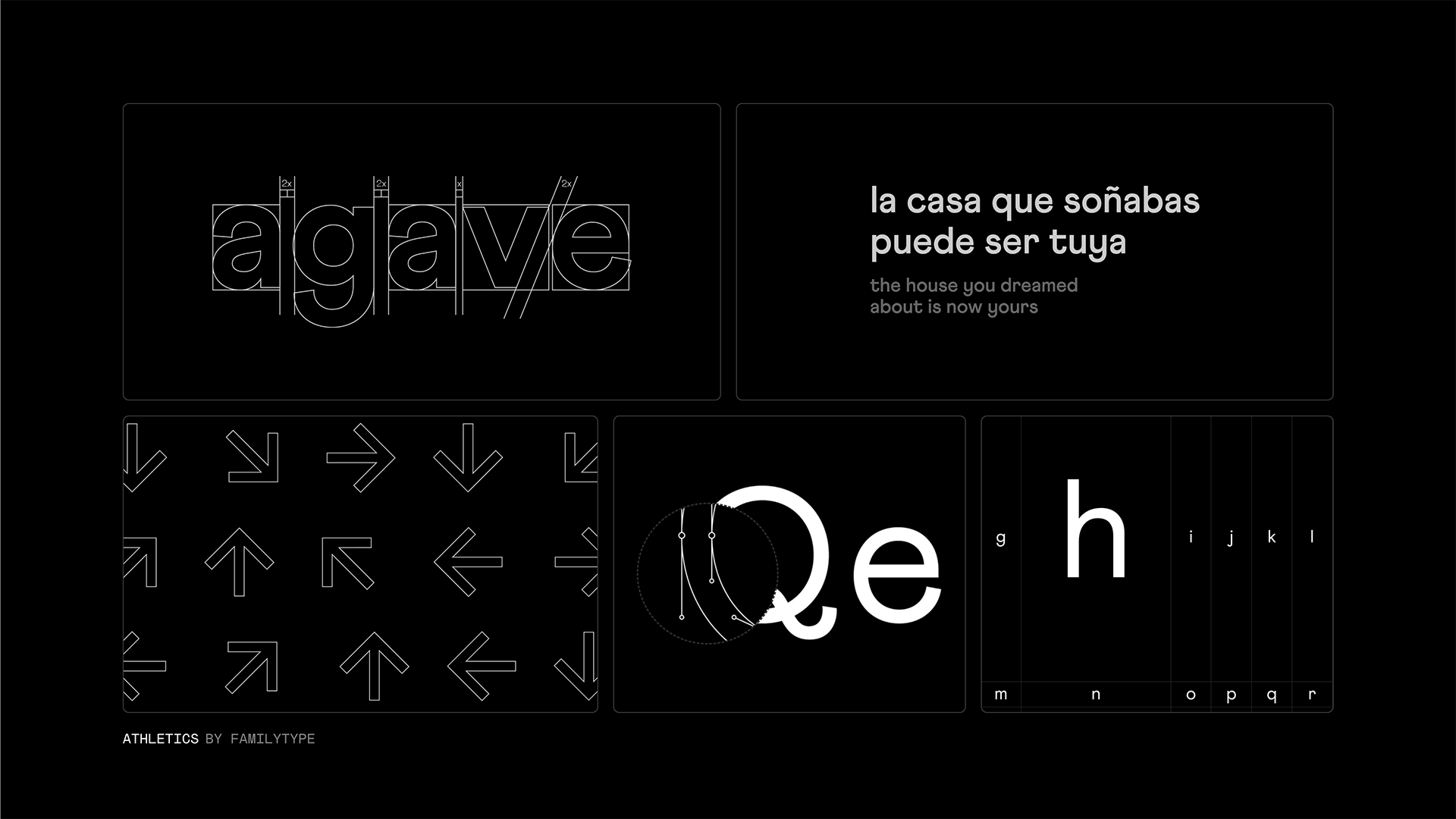
The Agave brand identity was crafted to embody the company's mission of making quality housing accessible. The logo draws inspiration from both architectural elements and the agave plant, symbolizing resilience and growth from strong foundations.
Marketing Materials
Property Showcases

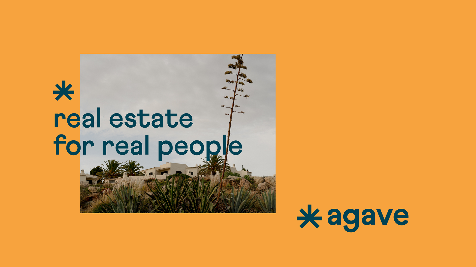
Concept
We wanted to convey a strong positive message to hard-working families. Our brand concept "Real estate for real people" guided all design decisions, from photography style to copywriting tone. The goal was to bring joy and a spark of hope to those fighting to make their dream home a reality.